BEASTSAVERS!
Crafting a Children's Series from Sketch to Shelf
When author-illustrator Jon Upton first approached us about BeastSavers!, his eyes lit up as he described his vision: an action-adventure chapter book series that would bring the energy of Saturday morning cartoons to the page for readers aged 7-12. Jon had the creative foundations firmly in place – compelling story, vibrant illustrations, and a clear vision for his world. What he needed was an experienced hand to guide his creation through the complex journey to published book.
The Creative Partnership
As an experienced writer and illustrator but first-time publisher, Jon found himself in a familiar position: incredibly skilled at crafting the content but unsure how to transform it into a market-ready book. Our partnership proved particularly energizing as we shared a deep love for animation and fantasy, allowing us to speak the same creative language while bringing complementary skills to the table.
Setting the Foundation
The first step was establishing a clear roadmap to publication. Working backward from our target holiday season release date, we broke the project into manageable phases. This was particularly crucial given Jon's dual role as writer and illustrator. Rather than letting these responsibilities compete for his attention, we created dedicated blocks of time: focused weeks for finalizing the manuscript, followed by concentrated periods for illustration work.
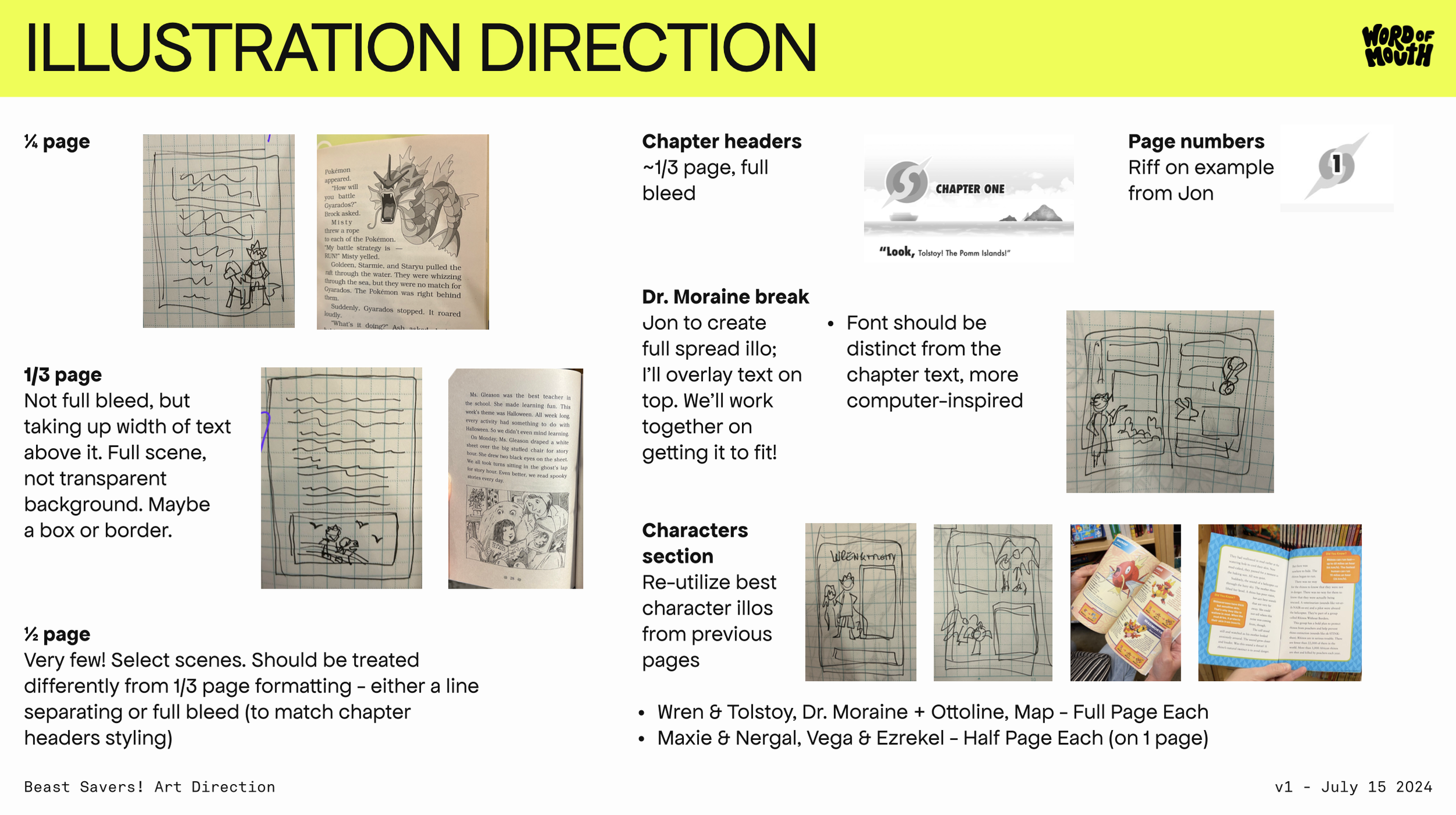
Our market research phase proved invaluable in positioning BeastSavers! within its genre while ensuring it would stand out. We spent time exploring other books in the 7-12 age range, examining everything from paper stock to page size, typography to illustration placement. This research helped us identify opportunities to create something uniquely "BeastSavers!" while still meeting the expectations of our young readers.
Developing the Visual Identity
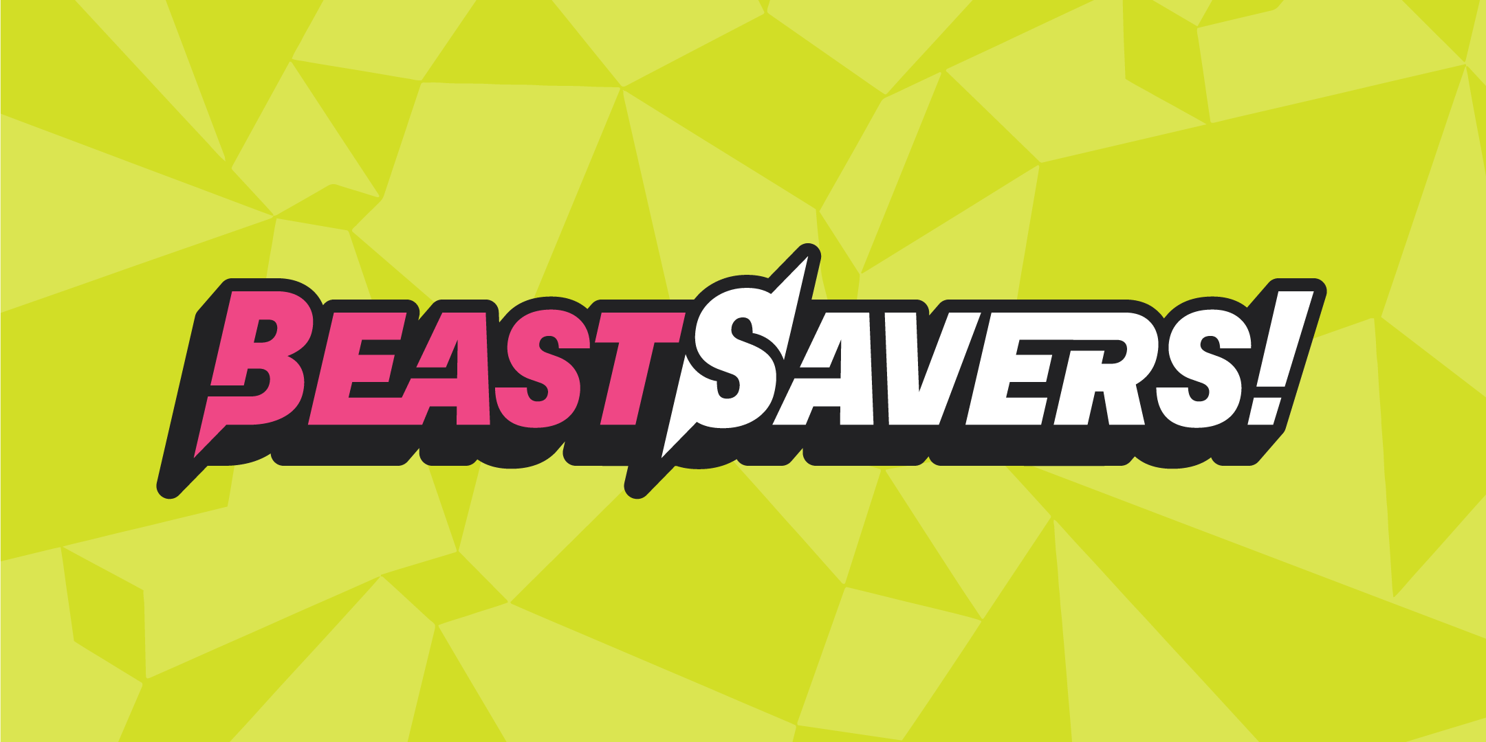
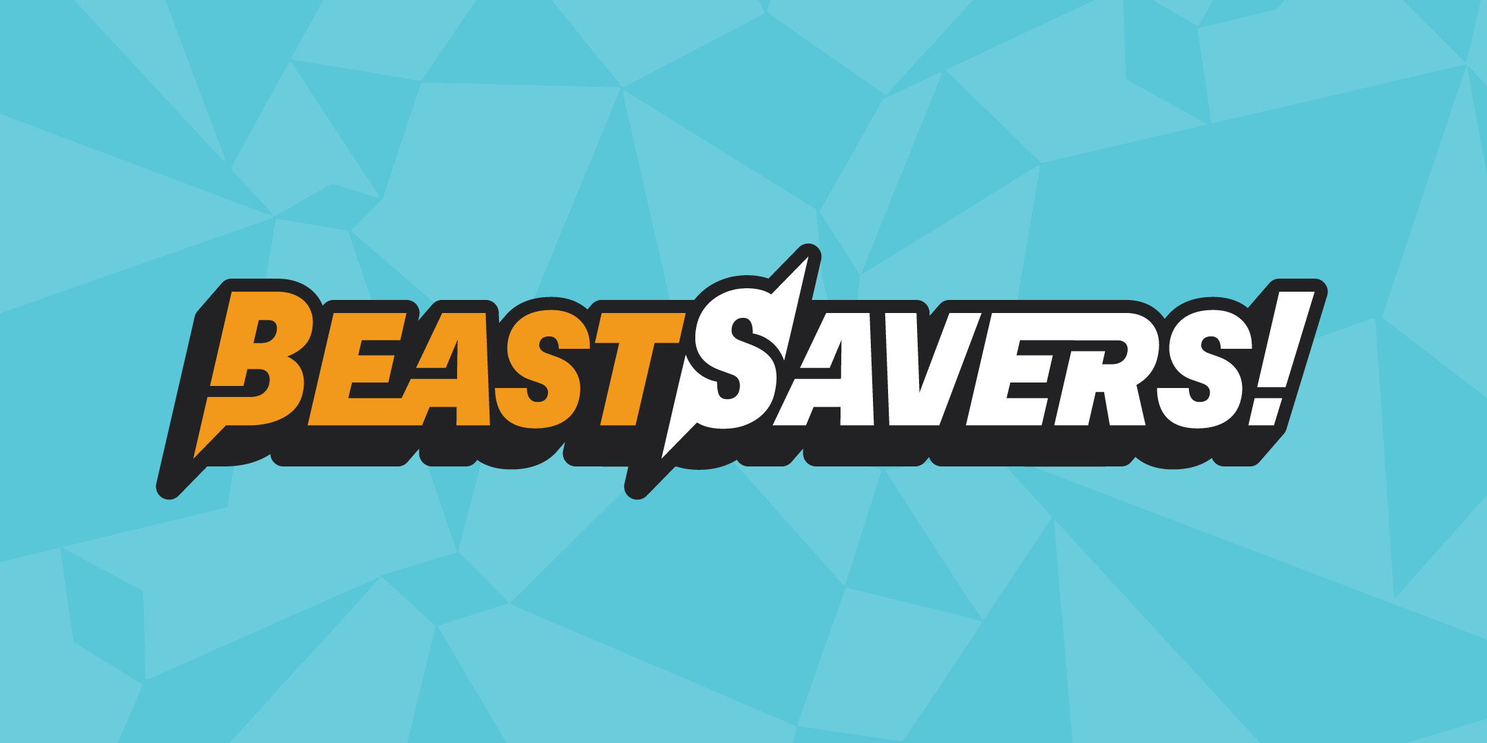
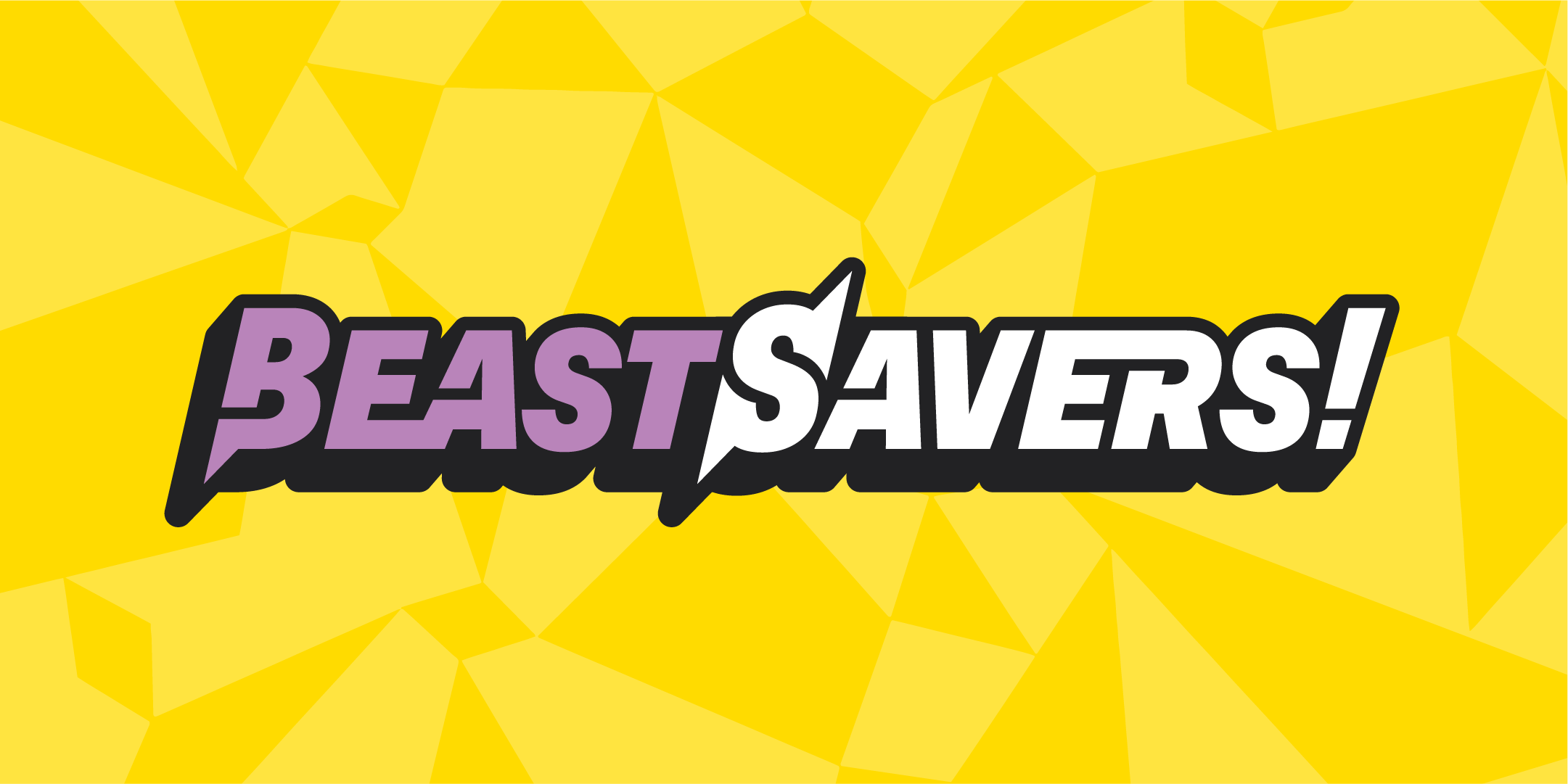
The logo development process perfectly exemplified our collaborative approach. Jon came with initial concepts, which we then refined together. We explored two distinct directions – one emphasizing the "Beast" aspect and another leaning into the tech elements of the story. The tech-forward approach won out, better reflecting the story's setting and tone. In a decision that would prove crucial for the series' future, we moved away from the original blue and yellow color scheme to a more flexible system: one signature color that could change with each volume, paired with consistent white elements.



Building the Book
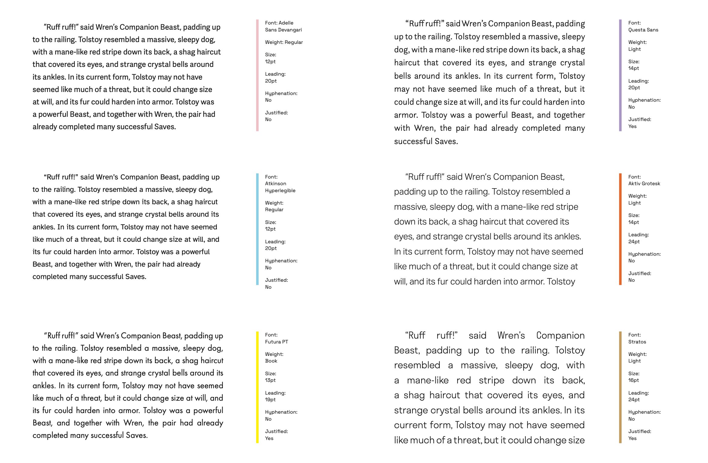
Typography became one of our earliest and most important decisions. We needed a typeface that could accomplish multiple crucial goals: legibility for young eyes, a modern tech-forward feel that matched the story's tone, and enough personality to feel distinctive without becoming distracting. We increased the leading from Jon's initial mockups and carefully considered minimum size requirements for our audience.
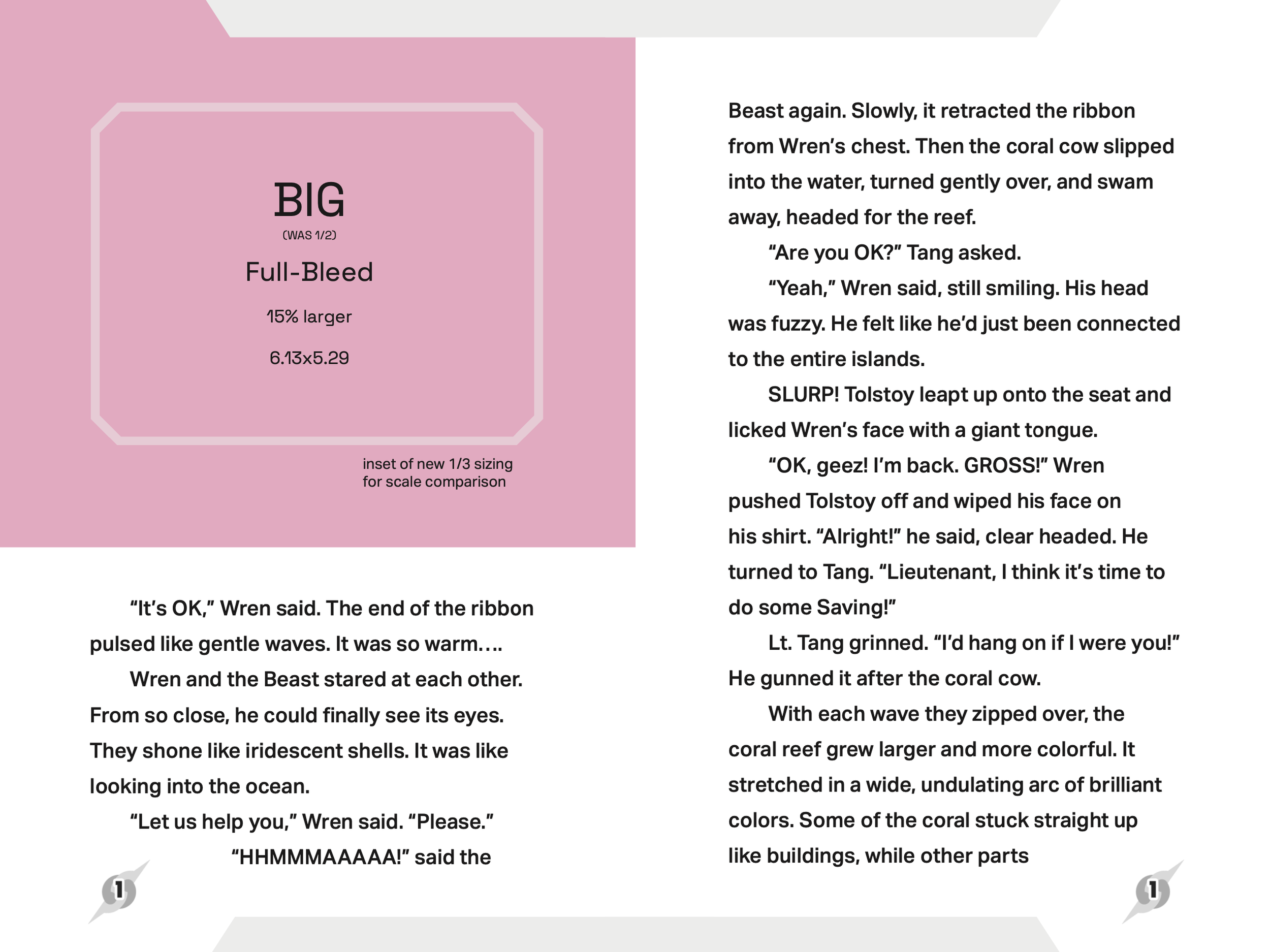
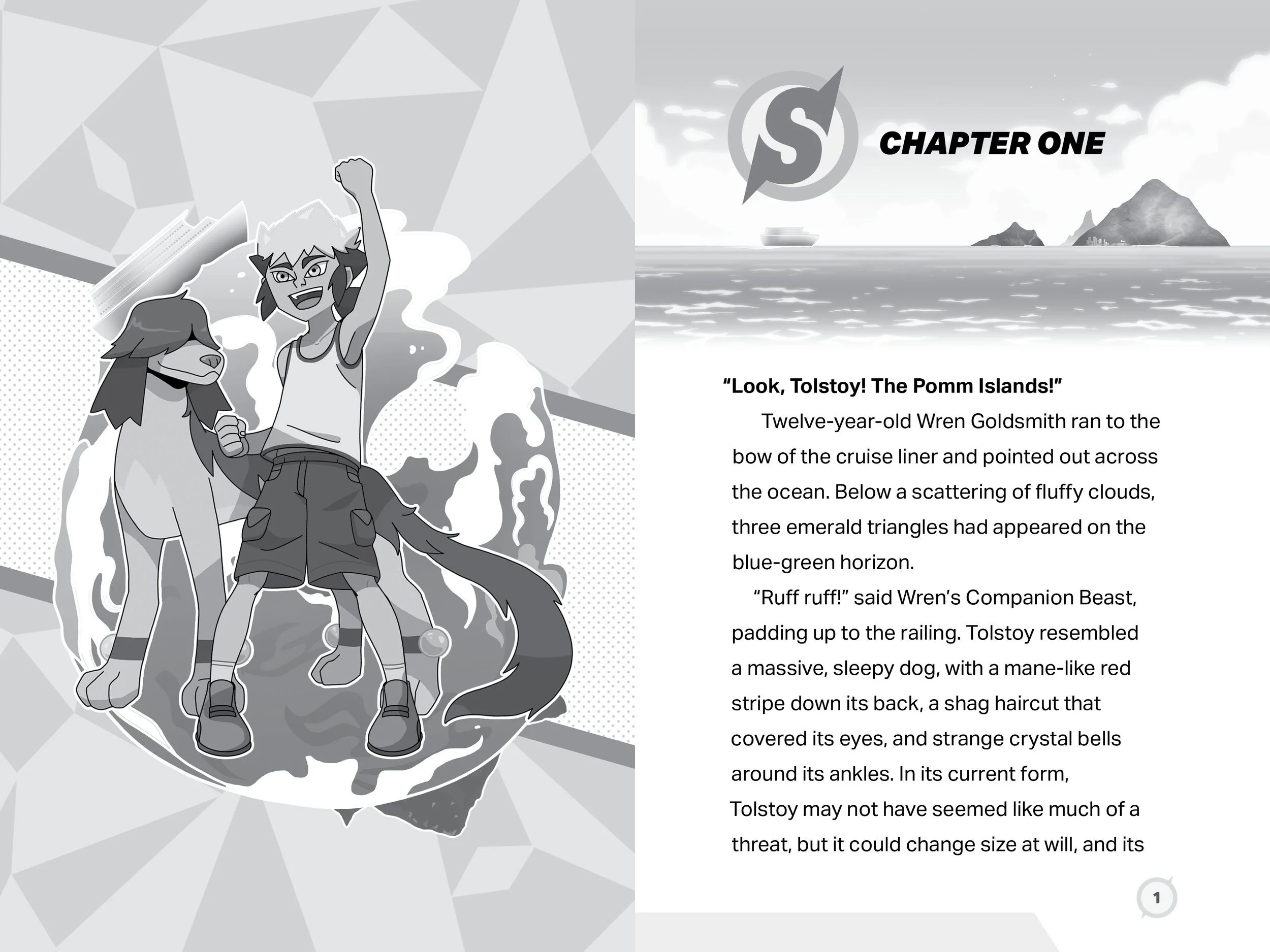
As Jon worked on illustrations, we developed a systematic approach to their integration. Every illustration size and treatment was standardized, with angled edges that connected to the angular elements in our logo design. This system gave Jon clear parameters for his artwork while ensuring visual consistency throughout the book.
The interior design came together as a careful balance of professional publishing standards and creative flourishes. We maintained consistent baseline grids and managed technical considerations like widows and orphans, while weaving in elements of the BeastSavers! world. Even the page numbers became an opportunity for brand reinforcement, incorporating a simplified version of our logo mark.
The Final Product
The end result is more than just a book – it's the foundation for an entire series. Every decision, from the adaptable color scheme to the standardized illustration treatments, was made with future volumes in mind. We successfully translated Jon's creative vision into a professional, market-ready product that maintains all the energy and excitement of his original concept while meeting the practical demands of print publishing.
Perhaps most importantly, we created something that will truly resonate with young readers, bringing them the same joy and excitement that Saturday morning cartoons brought to previous generations – just in a different format.


